Logos Archive
In under a decade, television ownership in the United States went from 20 to 90%. This potential for significant growth was evident, even in the early part of the 1950s. Recognising this, Columbia Broadcasting System split into two dedicated networks for television and radio, and directed to do everything possible to create their own distinct identities.
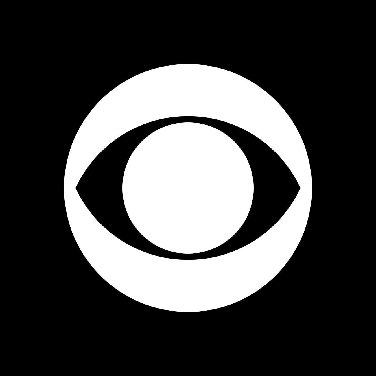
When CBS Television Network (CBS) debuted the first documentary series "See It Now” and captured the broadcasting spotlight when it premiered "I Love Lucy" CBS President Frank Stanton saw an opportunity to capitalise on this new interest by introducing a new corporate identity. The responsibility for developing this fell to William Golden. Golden had started his career in the CBS Radio promotion department in 1937 and, by 1951, had worked his way up to creative director of advertising and sales promotion.
The introduction of a new logo intended to help separate CBS Network Television from the CBS Radio Network, clearly differentiate the network from other television networks and was part of a broader effort to develop the overall impression of CBS as a place to see quality images.

In the early part of the 1950s, having established its transpacific routes, Northwest Airlines–previously Northwest Airways–began trading as Northwest Orient Airline and pushed ahead with expansion. This expansion introduced new aircraft to the fleet, increasing flights, speed and passenger volume, and improving overall comfort. However, as the airline grew its fleets and destinations, by the late 1960s a mix of fonts, colours and design elements, as well as inconsistent naming which included Northwest, Northwest Airlines, Northwest Orient and NWA, had led to a ‘communicative dissonance’ in the marketing of the airline to potential passengers. With this in mind, Northwest Orient Airlines sought out a designer to develop a unified corporate image and logo.

Blue Circle Industries was formed in 1900 as the Associated Portland Cement Manufacturers Ltd from the amalgamation of 24 cement works. By the mid-1960s, following a period of international expansion, The Blue Circle Group had grown into the largest cement manufacturer in the world.
Based in London, the group was made up of parent company The Associated Portland Cement Manufacturers Ltd. (APCM) and its sales arm the Cement Marketing Company (CMC). The group also had a number of subsidiaries and allied companies that had created a complex tapestry of entities while post-war diversification had also created a broad range of products. The use of inconsistent trademarks and names, and the growing number of products had created a confusing and divisive situation for the group.
Based in London, the group was made up of parent company The Associated Portland Cement Manufacturers Ltd. (APCM) and its sales arm the Cement Marketing Company (CMC). The group also had a number of subsidiaries and allied companies that had created a complex tapestry of entities while post-war diversification had also created a broad range of products. The use of inconsistent trademarks and names, and the growing number of products had created a confusing and divisive situation for the group.


Plaza Court, as it eventually came to be known, was located on Los Angeles’ Figueroa, between 7th and 8th Street. The complex would be made of three towers and a plaza with a mix of offices, retail spaces and an open courtyard that featured a geodesic canopy and focal point. This canopy was designed and developed by renowned architect Jon Jerde who became an innovator in the design of malls and related spaces. The challenge of creating the logo and visual identity for Plaza Court was given by Canadian developer Oxford Properties to Bill Cannan & Associates, who completed the work in 1989.

In 1955 architect Edward Barnes was hired as a design consultant for Pan American Airways just as the company began to introduce commercial jets to the America market.
The half wing symbol, which was common to aviation, was replaced with a blue globe with fine curved lines of negative space intersecting it. This was a bold and modernist expression that avoided geographic representation, instead, favouring an abstract vision of a world without borders, fitting for the dawning of a new age of commercial aviation.
The half wing symbol, which was common to aviation, was replaced with a blue globe with fine curved lines of negative space intersecting it. This was a bold and modernist expression that avoided geographic representation, instead, favouring an abstract vision of a world without borders, fitting for the dawning of a new age of commercial aviation.

Golden Gate Bridge, Highway and Transportation District operates three key transport aspects of the Golden Gate Corridor; the Golden Gate Bridge (1937), the Golden Gate Ferry (1970) and bus service Golden Gate Transit (1972).
This network of transport services was created to link Marin County, north of San Francisco, with the City, and alleviate traffic congestion, reduce pollution and take over an unprofitable commuter bus service.
This network of transport services was created to link Marin County, north of San Francisco, with the City, and alleviate traffic congestion, reduce pollution and take over an unprofitable commuter bus service.